How to wear Pastel Color Trend
How to wear Pastel Color Trend
Pastel Colors have always been a part of my heart. As mentioned HERE
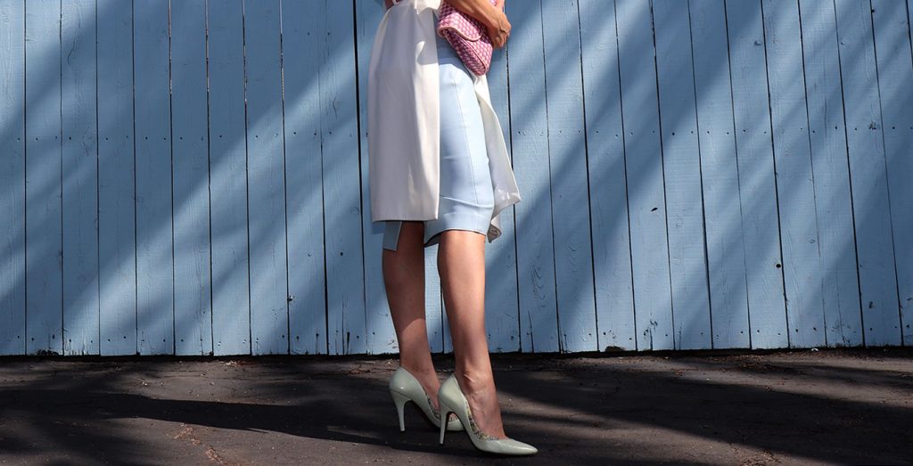
I have always used it in my shoe collections, –always in the Pumps Collection– Adding a differrent and subtle detail that makes all the difference. I like it and I can see that my clients appreciate that kind of detail too ?
The must have pastel color for 2018
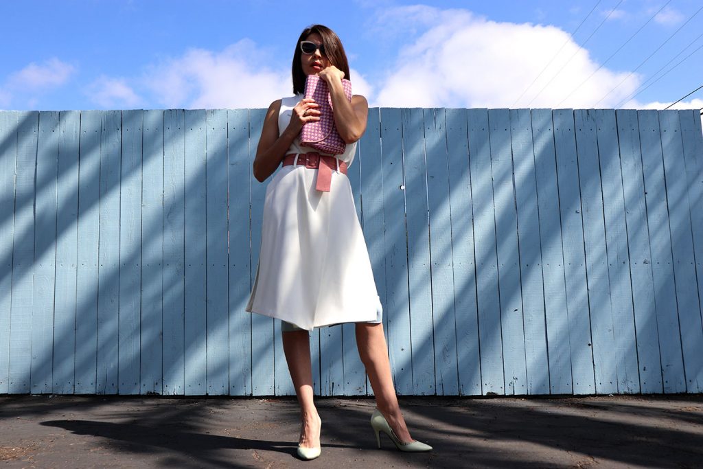
Little did I know I was wearing four ???? of the most seen pastel colors for Spring Summer 2018.
I was just missing the yellow ? just like this VOGUE Italy article
Purple: Pantone’s 2018 color of the year is Ultra Violet
Rapture rose: a full, princess-like, intense pink shade.
Sky blue: a fresh color that evoke a serene sky.
Light green: green is back also for summer 2018, this time with a delicate and fresh nuance.
Military green: considered now as a neutral hue, just like beige, it often ‘breaks’ elegant or sporty looks on military style pieces
You can read more HERE
My Stylosophy Style
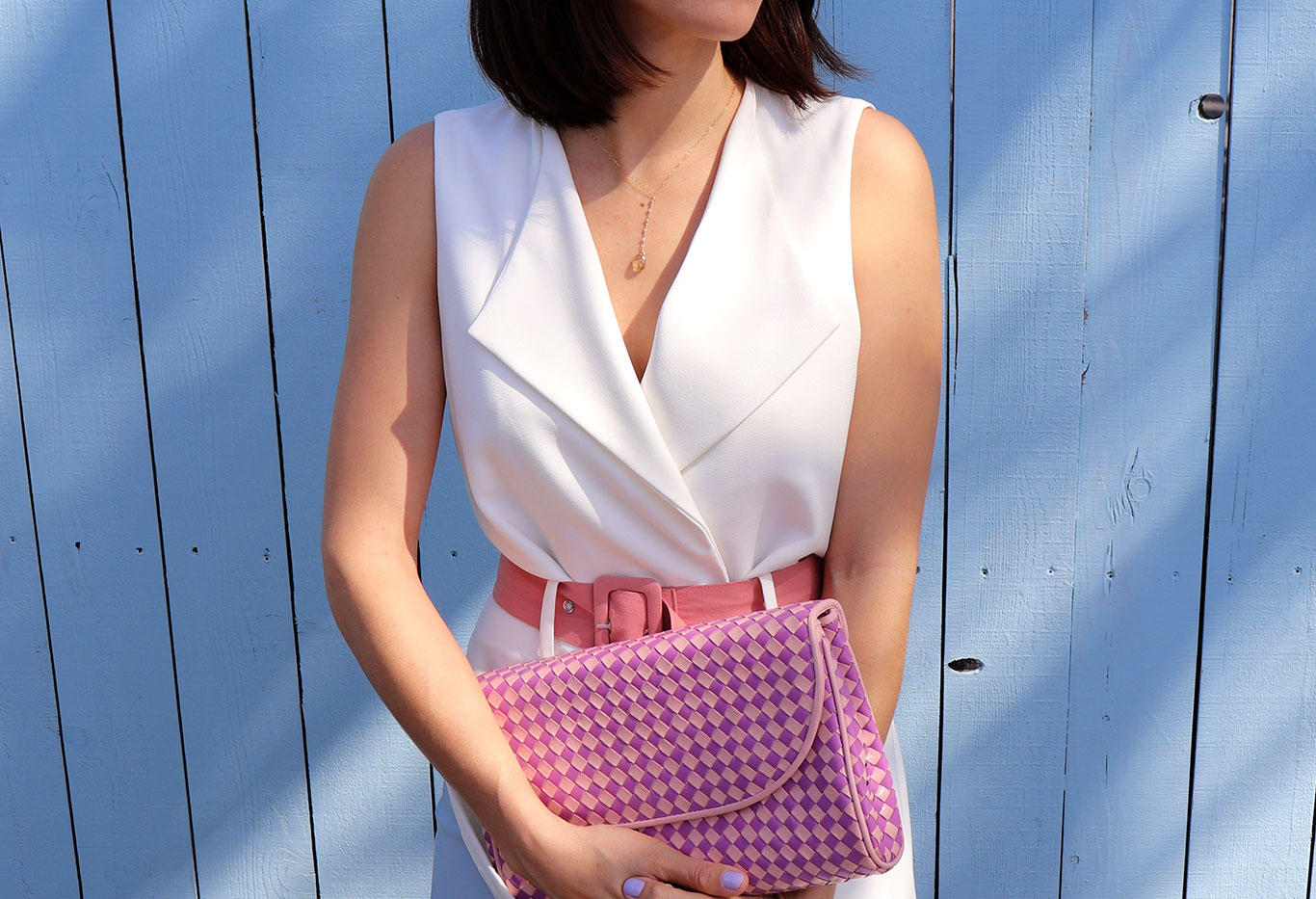
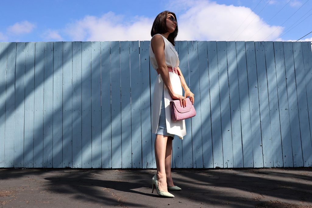
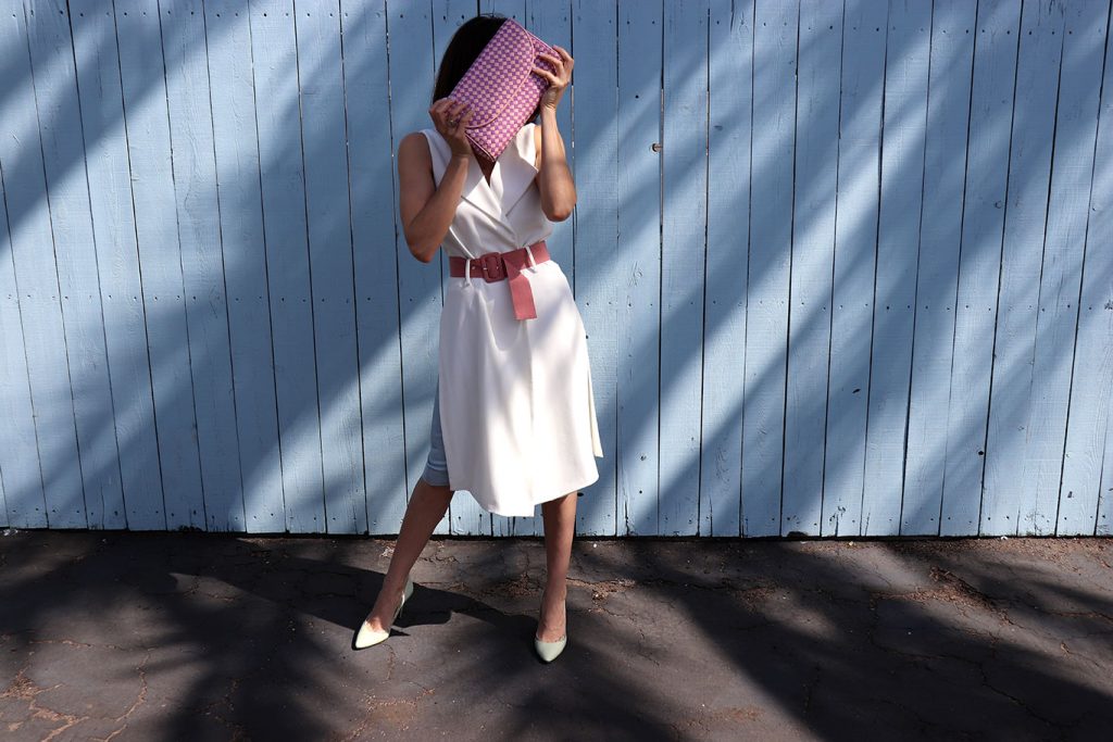
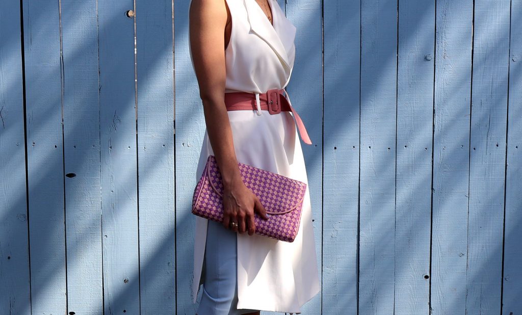
Putting together Pastel colors. ✋?It’s worth to mention that I already had everything I’m wearing (for a long time) but the belt.
Trying to maintain the same hardness of tone although they were different shades. Mixing the colors in the same look but maintaining a balance for the eye.
Like when you add the POP of color to some looks. Here it’s totally the opposite you keep the balance in the hue (color).
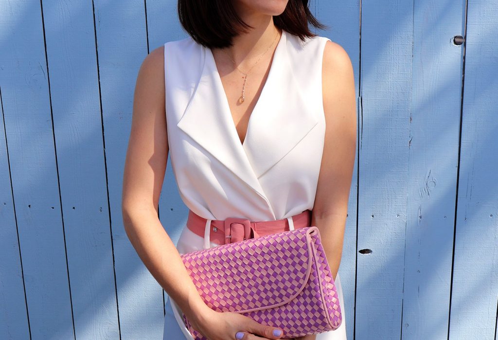
I loved the idea of adding the woven bag to to give the final touch within the same tone of the belt.
So what do you think about this look.
I would love to hear your comments!
Besos, Karla




2 comments
ough… gorgeous!
http://sepatuholig.blogspot.com
IG @grace_njio
Thanks Grace! ❤️